Cube view formatting controls how cube views display. Most of the format settings transfer to Excel and can still be overridden with the standard Excel styles. The formatting also transfers to reports where the cube view is being used in a data adapter.
Cube view formatting can be selected for the entire cube view or specific rows, columns, headers, and individual cells. The formatting options enable the number formats, percentage signs, scaling, currency symbols, colors, fonts, and font size to be unique to the business needs. Label row and column sets to support cube view maintenance when editing, formatting, and applying calculations.
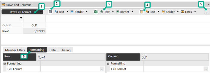
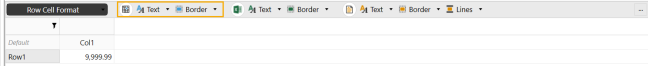
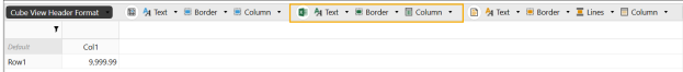
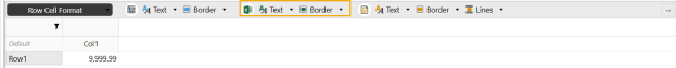
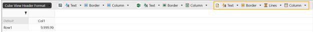
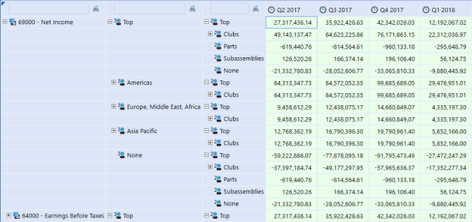
In the cube view, select the Rows and Columns slider. Then click an individual cell or header and then the Formatting tab to view and edit the toolbar options for data explorer, Excel, and report formats. The icons in the toolbar include the most common formatting properties. Each icon coincides with the cell selected in the Rows and Columns slider. For example, if a column header is selected, the formatting changes made will only affect the specific column header.
-
Selector
-
Data explorer formatting options
-
Excel export formatting options
-
Report formatting options
-
Advanced formatting options
-
Formatting tab
Set Up Basic Formatting for a Cube View
-
On the Cube Views page, under Cube View Groups, select a cube view.
-
Select Rows and Columns to expand the slider.
-
Select the row, column, or cell to edit.
NOTE: Click the Default cell to update the default settings for all headers and cells.
-
Click the Formatting tab.
-
Select the options to change the header and cell format settings for the data explorer, Excel, and report output types.
Data Explorer
The formatting settings available are organized in the following groups.
-
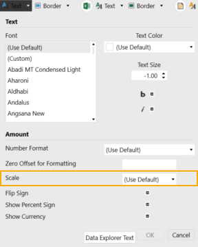
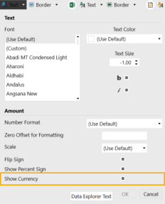
Text: Font, color, size, bold, and italic settings. When you select a cell, the following formatting properties become available in the Text drop-down menu: number, zero offset, scale, flip sign, show percent sign, and show currency.
-
Border: Background color and gridline color
-
Column: Whether the column is visible and its width
There are different settings available for the headers and cells.
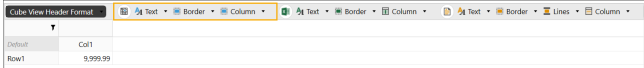
Excel
The formatting settings available are organized in the following groups.
- Text: Color, horizontal alignment, vertical alignment, indent level, and wrap settings. When you select a cell, the following formatting properties become available in the Text drop-down menu: number and use scale.
-
Border: Background color and the color and line styles of the cell borders
-
Column: Column width
There are different settings available for the headers and cells.
Report
The formatting settings available are organized in the following groups.
- Text: Color, alignment, size, and underline settings. When you select a cell, the following formatting properties become available in the Text drop-down menu: no data number, use numeric binding, and numeric binding.
-
Border: Background color and cell borders
-
Lines: Settings for the top and bottom lines for the first row, padding, color, and thickness
-
Column: Column width
There are different settings available for the headers and cells.
Apply Scaling, Indents, and Currencies
-
Scale: Open the Data Explorer Text drop-down menu to view the Scale setting. You can also apply it to Excel and report formatting.
-
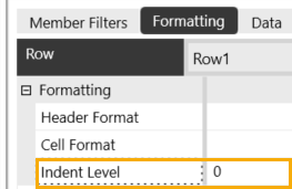
Indent level: On the Formatting tab for a row or column header, view the Indent Level setting.
-
Show currency: Open the Data Explorer Text drop-down menu to view the Show Currency setting.
Header Format Details
The formatting properties for a cube view header include default, row, and column headers. These properties are in the Rows and Columns slider. Not all properties are available for each header.
-
In the Rows and Columns slider, select the Default cell to apply the formatting settings to all of the cube view headers.
NOTE: You can select an individual row or column header instead if you want to edit the settings for a specific header.
-
In the Formatting tab, click the ellipsis to the right of Header Format.
-
Click Format to view the options. The Excel section only affects how the cube view data display in Excel.
-
Custom Parameters: Click the ellipsis to select and assign a custom parameter such as a cube view style to the cube view header.
-
RowExpansionMode: Control expansion of nested rows. This determines how rows are displayed in the data explorer grid. The default sets this property to False.
-
ShowDimensionImages: Set to False to hide the dimension icons in the data explorer grid row and column headers. The default setting will display the dimension icons.
-
HeaderWrapText: When False, column and row header text does not wrap. When set to True, column and row header text displays as wrapped. This applies to Default Cube Views and works with Header Overrides.
NOTE: ColumnWidth and Row Header Width must be set from the Header Size settings menu for row header text to wrap
-
IsColumnVisible: Set to False to hide specific columns. Set this property at run time with a parameter to show and hide detail.
-
ColumnWidth: Enter a numerical value for column width. If the header label exceeds the column width, the header will automatically wrap the text.
-
ColumnHeaderWrapText:False, column header text does not wrap. When set to True, column header text displays as wrapped. This applies to individual column headers and works with Header Overrides. ColumnWidth must be set for Column Headers to wrap.
NOTE: ColumnWidth must be set for header text to wrap
-
MergeAndCenterColumnHeaders: When set to False, column headers are left justified. When set to True, column headers are centered. This applies to Default Cube Views or individual column formatting in Data Explorer and Reports.
NOTE: MergeAndCenterColumnHeaders does not apply to Header Overrides.
-
IsRowVisible: Set to False to hide specific rows. Set this property at run time with a parameter to show and hide detail.
-
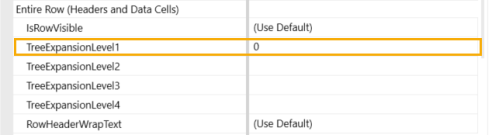
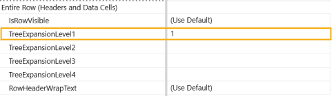
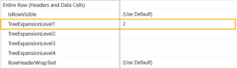
TreeExpansionLevel1-4: Automatically expand up to 4 nested rows in Data Explorer. Enter the number of rows to be expanded from 0 – 4 in the corresponding TreeExpansionLevel.
NOTE: For TreeExpansionLevel to work, RowExpansionMode from the Default Header must be set to "Use Default". Using Collapse All or Expand All overrides this setting.
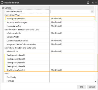
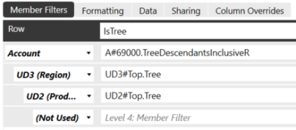
TreeExpansionLevels are tied to the Member Filter Dimension Types on the Designer tab and require a .Tree Member Expansion.
NOTE: Default settings are overwritten by Row Overrides when set.
Set the TreeExpansionLevel to 0 to collapse all nested rows.

Set the TreeExpansionLevel to 1 to expand the first level of nested rows.
Set the TreeExpansionLevel to 2 to expand the first two levels of nested rows.
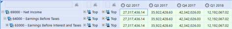
Set the TreeExpansionLevel to 3 to expand the first 3 levels of nested rows.
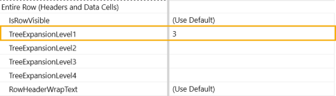
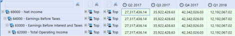
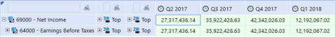
This example shows the TreeExpansionLevel 1, 2, and 3 expanded:
-
RowHeaderWrapText: When False, row header text does not wrap. When set to True, row header text displays as wrapped. This applies to individual row headers and works with Header Overrides.
NOTE: Row Header Width must be set from the Header Size settings menu for row header text to wrap.
-
Font and color options are available. For the FontFamily, any .Net font installed on the Excel client operating system is included in the font family. The FontSize default is 11.
-
ExcelMaxOutlineLevelOnRows and ExcelMaxOutlineLevelOnCols: Up to six outline levels can be used for the creation of collapsible and expandable Excel groups of rows or columns when exporting. Enter the number of outline levels needed. This relates to the Excel Indent Level setting that is applied in the header format on each row or column, so the number entered here should equal the highest setting applied on the rows or columns.
-
ExcelExpandedOutlineLevelOnRows and ExcelExpandedOutlineLevelOnCols: When a cube view is exported to Excel, these settings control to which outline level the file is initially opened. The default is 1, which means each grouping is fully collapsed.
-
ExcelColumnWidth: Default Excel column width in pixels unless overridden in columns.
-
ExcelOutlineLevelCol and ExcelOutlineLevel: Default Excel outline level for rows and columns is 1 unless specified here or overridden in rows or columns.
-
ExcelHorizontalAlignment and ExcelVerticalAlignment: Control how the data will be aligned horizontally and vertically using the Excel standard alignment options.
-
ExcelIndentLevel: The number of characters to indent the text or value.
-
ExcelWrapText: This determines if text like headers will be wrapped in the output.
-
Color and border options are available.
-
ReportSeparateBandPerCubeViewRow: This is a setting to optimize performance for large cube views that will be dynamically generating a data explorer report with many row definitions with unique formatting. Default setting is (Use Default), which is a conditional setting. This applies to when a data explorer report is run from a cube view and background temporary database tables in memory, one for each row name in the cube view are created. If there are more than 100 row definitions, fewer report bands (separate temporary in-memory tables) are created, combining rows where formatting is the same. Set to True to create a separate table per cube view row definition, which may affect performance with hundreds or thousands of row definitions. Set to False to combine row definitions of the same format into fewer temporary in-memory tables.
-
Page and column header and table layout options are available.
-
ReportColumnWidth and ReportRowHeight: Sets the width of a column or the height of a row by number of pixels.
-
ReportTopLinesOnFirstRowOnly and ReportBottomLinesOnLastRowOnly: If the row definition results in multiple rows, a top line will be placed on the first line only or a bottom line will be placed on the last line only.
-
ReportBandHeightBeforeFirstRow and ReportBandHeightAfterLastRow: Allows a number to be entered in pixels to add before the first row or after the last row of where a row definition starts.
NOTE: The top and bottom report bands used for lines and spacing are removed if there are no data rows or for suppressed rows.
-
ReportRowPageBreak: Applies a page break where appropriate for this row.
-
ReportRowContentTop: Specifies the vertical position of the row relative to the row above it. If it is set to zero, the top of the row immediately follows the row above it with no vertical spacing.
-
ReportRowContentHeight: The height of the row in pixels.
-
ReportRowPaddingTop and ReportRowPaddingBottom: Control the extra space (padding) above and below a row in a report.
-
ReportFontSize: The point size of the font on the report if it differs from the font size displayed in data explorer.
-
ReportTextAllignment: Controls how the data are aligned in a report.
-
ReportUnderline: Creates a simple underline of report values.
-
Color options are available for text and background.
-
Top Lines and Bottom Lines: Used for underlines and overlines. The Line1 and Line2 options can be used together to create a double underline or double overline. For the lines to have a small gap between each column, use the ReportBottomLine1PaddingLeft property or one similar.
-
Borders: Allows a line to be drawn around the border of a cell.
Cell Format Details
The format properties for a cell include font, colors, background, and grid lines.
-
In the Rows and Columns slider, select the Default cell to apply the formatting settings to all of the cube view cells.
NOTE: You can select an individual cell instead if you want to edit the settings for a specific cell.
-
In the Formatting tab, click the ellipsis to the right of Cell Format.
-
Click Format to view the options. The Excel section only affects how the cube view data display in Excel.
-
Custom Parameters: Click the ellipsis to select and assign a custom parameter such as a cube view style to the cube view cell.
-
NumberFormat: Uses the Microsoft .NET standard number format syntax, which allows different formats to be specified for positive and negative numbers separated by a semi-colon (not available in Excel). For example:
-
#,### ;(#,###);0 would show the number using a comma as the thousands separator, no degrees of precision, parenthesis around negative numbers, and a zero for null values. The pattern of this format choice is Positive;Negative;Null values with each separated by a semicolon. After the first #,### there is a space. This enables the numbers to line up with negative numbers due to the parenthesis.
-
#,###.#% ;(#,###.#%);” – “ would show a percentage with a comma as the thousands separator, one degree of precision, negative percentages in parenthesis and a dash for null values.
-
N2 would show the data as a numeric value with two degrees of precision. Negative numbers are presented with a minus sign.
-
P1 would show a percentage with one degree of precision.
-
-
ZeroOffsetForFormatting: Related to NegativeTextColor, which is determined by whether a number is less than zero. For example, if sales were less than 100, rather than 0, they could be displayed in red. A valid setting is any number other than zero.
-
Scale: -12 to +12 are the valid values for the scale. For example, to show a number in thousands, the scale should equal 3, or for millions, the scale should equal 6.
-
FlipSign: This will flip the display value between positive and negative. This is useful for reports where certain expense numbers are stored as positive or negative and need to be shown on the report.
-
ShowPercentageSign: Determines whether a percentage sign is displayed.
-
ShowCurrency: Shows the currency code (for example, EUR). This is not available in Excel.
-
Font and color options are available. For the FontFamily, any .Net font installed on the Excel client operating system is included in the font family. The FontSize default is 11. NegativeTextColor, WritableBackgroundColor, and SelectedGridLinesColor can optionally override the format for negative numbers, writeable data cells, and selected data cells.
-
ExcelNumberFormat: Apply to control how numbers display when exporting to Excel. A number format can have up to four sections of code separated by semicolons. These code sections define the format for positive numbers, negative numbers, zero values, and text, in that order.
<POSITIVE>;<NEGATIVE>;<ZERO>;<TEXT>
For example, use these code sections to create the following custom format. Note that this format can include the underscore to create a space after the trailing positive number and can control the color of the negative number to be red:
#,##0.00_);[Red](#,##0.00);0.00
NOTE: ExcelNumberFormat settings [#,##0,,.0 ;[Red](#,##0,,.0)] on a cube view scales numbers when the cube view is exported to Excel.
-
ExcelUseScale: Determines if Excel uses the scale property.
-
Alignment, color, and border options are available.
-
ReportNoDataNumberFormat: By default, NoData (null) cells display as empty in the data explorer and as zeros in a report. However, any .NET number format text can be specified to format those zero values differently in the report. For example, type NODATA in that setting. To display empty text, type # in that setting. If the number format setting of the cell already does something with null values, this property does not need to be filled.
-
ReportUseNumericBinding and ReportNumericBindingFormat: These are related to the export of dashboard reports to Excel, so numbers can be rendered in the proper number format rather than appear in Excel as text. Set ReportUseNumericBinding to True to use numeric amounts instead of OneStream text-based formatting when generating a cube view report. The ReportNumericBindingFormat setting must follow a specific syntax. This number format is related to the report engine, so Excel standard number formats are not used. For example, to represent a number format for positive, negative, and no values:
{0:#,# ;(#,#);" - "}
This feature provides the ability to generate numbers instead of text when exporting a dashboard report to Excel. However, it cannot be used for calculation status and annotation data cells because those features cannot be represented as numbers. In those cases, use column overrides to display the values as text.
-
Position, font, color, top lines, bottom lines, and borders are available. See Header Format Details.


